Medieval Blacksmith 21325 Review
In 21325 Medieval Blacksmith, LEGO sells an AFOL-quality castle MOC as a set.
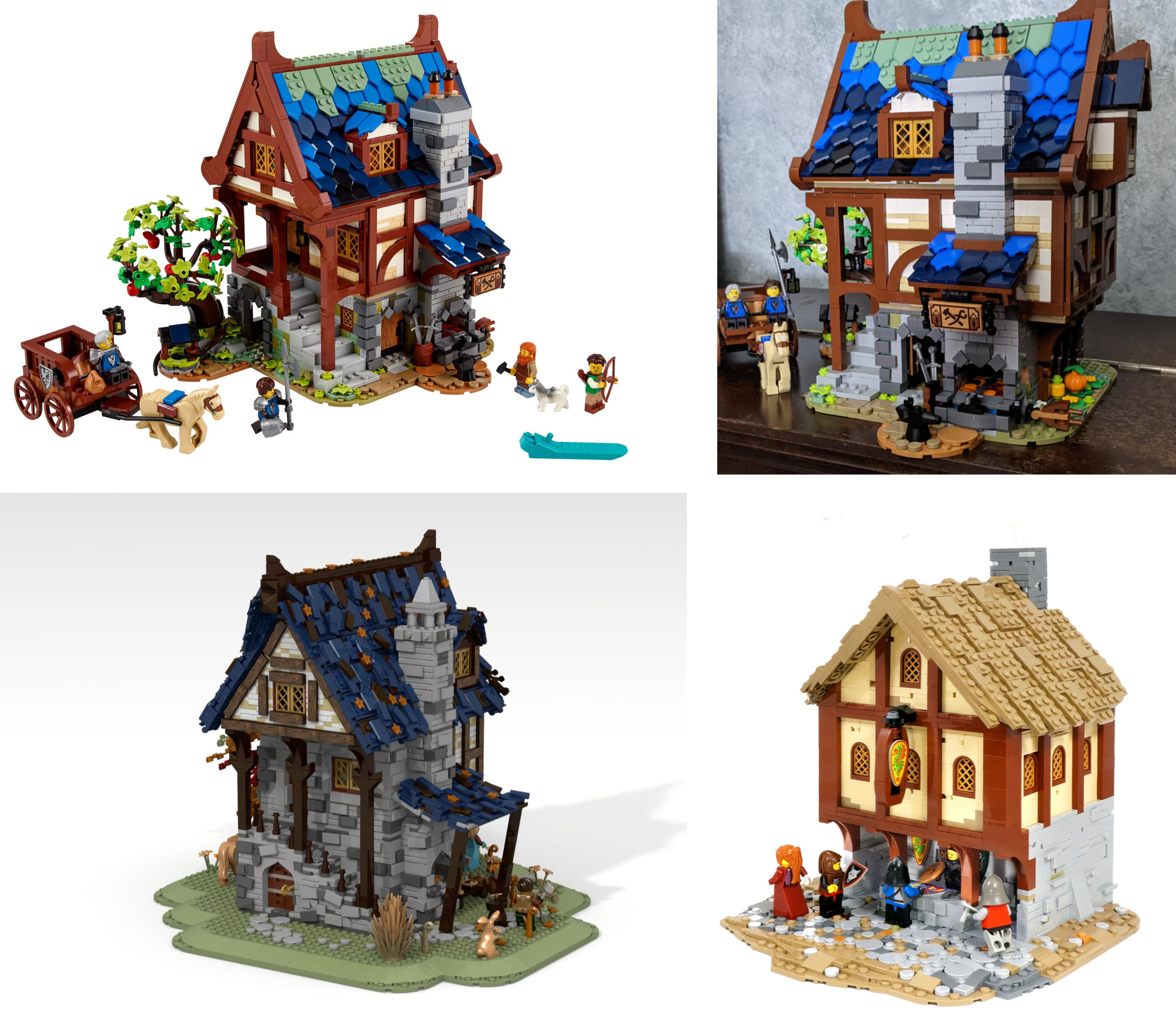
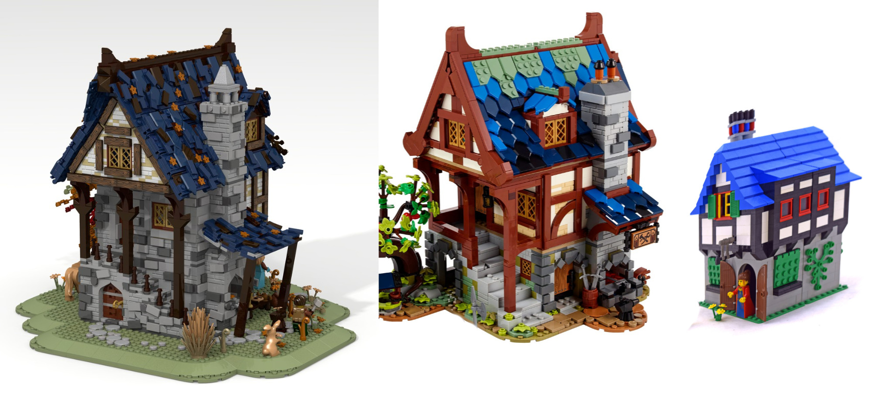
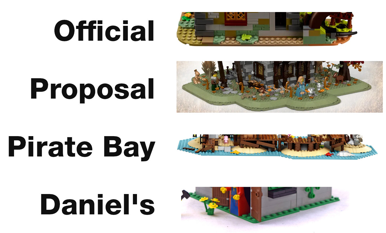
The 33rd LEGO Ideas set has been released, the LEGO® Ideas 21325 Medieval Blacksmith. I was available on February 1, 2021 for $149.99 in the US and sold out the first day. In this review, I’ll be comparing the official set with Clemens Fiedler’s proposal as well as Daniel Siskind’s Blacksmith Shop 3739 released in 2002. This will be an AFOL targeted review focused on features, parts and techniques; my opinions will be italicized.
|
Contents |
Overview
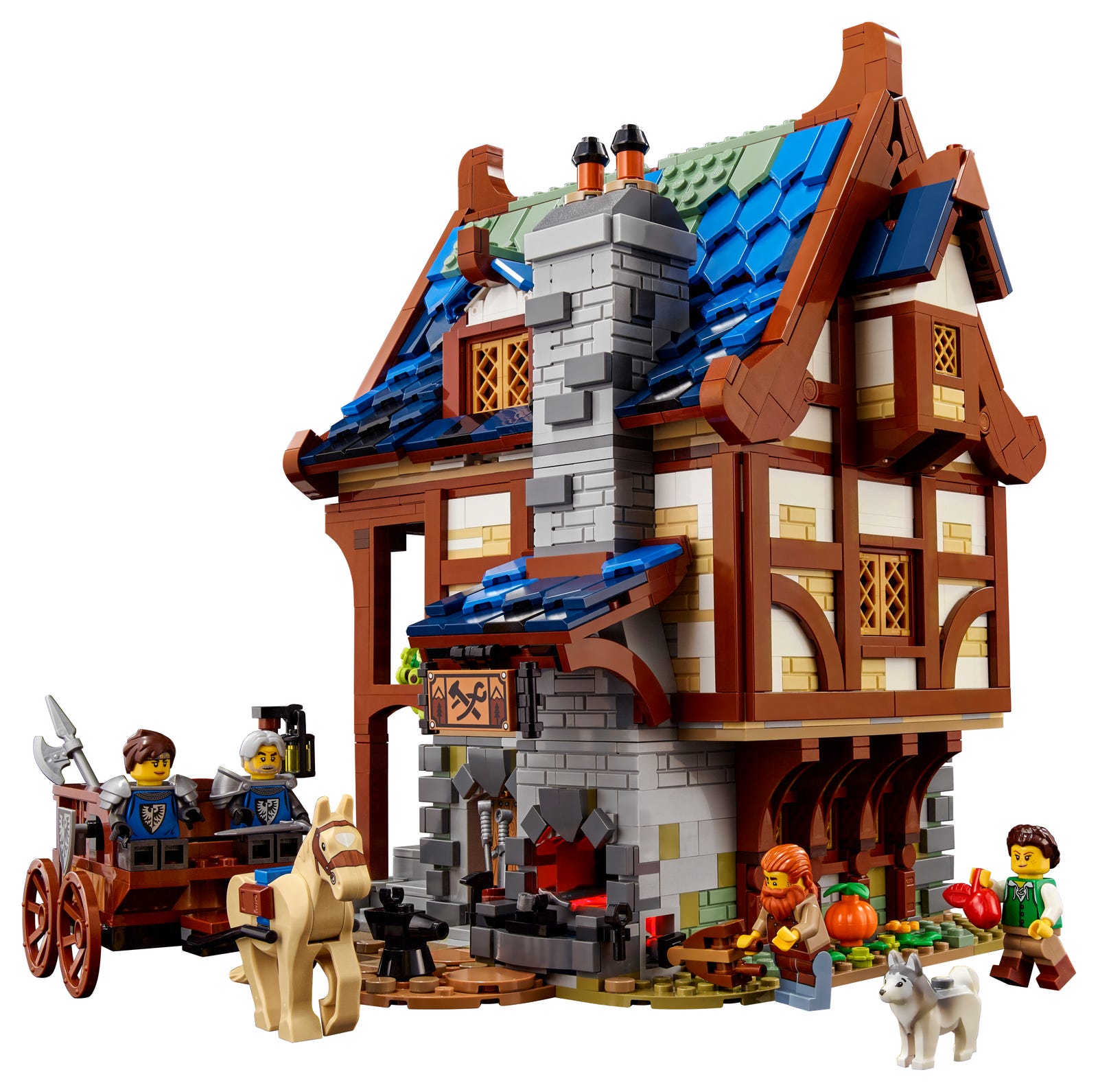
This modular-sized medieval building clocks in at 2164 pieces. It has been marketed to adults, both with the “18+” age rating as well as with the “Adults Welcome” tagline.
The approved product idea (AKA proposal) was designed by Clemens Fiedler “Namirob” and the final set was designed by LEGO Model Designer Wes Talbott and LEGO Graphic Designer by Austin Carlson
The set comes with four minifigures: a red-bearded blacksmith, female archer and two knights. The knights heraldry features the classic Black Falcons crest but with more detail, both on the minifig torsos and shields. Three animals are provided: a tan horse, husky dog and frog. Sadly, LEGO did not bring back the goat.

The building itself sits on an irregular plate-built base. A fully decorated interior is accessible by removing each story and one side of the roof. The first floor is a place of work. The forge is available both inside and outside the building. The second floor consists of a kitchen and the third has the bedroom.
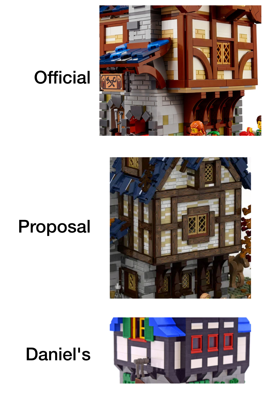
The building walls are stone for the first floor and half timber (Tudor style) for the second and third floors. Slate is the material of choice for the roof. The techniques used for each of these areas are quite detailed. In 21325 Medieval Blacksmith, LEGO sells an AFOL-quality castle MOC as a set. Much of the original detail in the proposal has been retained in the official set with a few critical changes; read on for a deeper dive into these differences as well as the building techniques used to create this incredibly detailed set.
Detailed Look
I’ll first cover the build as a whole and then move to the base and work my way up, carefully covering the techniques used for each part. I’ll compare them to the proposed model, as well as the 2002 blacksmith and interject my comments as I go. I’ll also refer to the Old Fishing Store 21310 as it also a detailed Ideas building at the $150, ~2,000 piece mark and Pirates of Barracuda Bay 21322 as it is a recent ‘historic’ Ideas set.
In my mind, there were three major changes between the proposed MOC and the final set:
- Color palette
- Size/scope
- Roof design
But I’m getting ahead of myself; looking at the whole set…
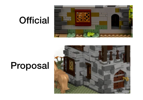
Color Palette
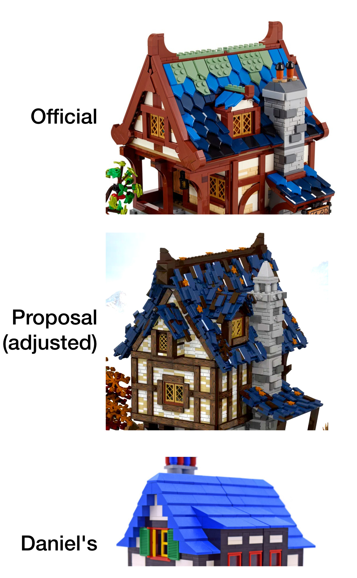
We can see a very bright scene, which is in contrast to the muted colors in Clemens’ original proposal.
Looking at the official art when compared to the proposal rendering, the color palette is much brighter. This comes from two key changes. The first is the use of brighter blues and sand green on the roof. The second from the use of reddish-brown for the wood compared to the dark brown off the submission.
Sitting on my piano, the built set does not look quite as bright as the marketing photo/render for the official set, but is still much brighter than the initial submission. The original submission render is fairly dark, you can see the light bley stone looks darker than the official set, my picture or this other MOC I created.
The use of lime green foliage also adds to the brightness of the official set both on the tree and on the ground around the building.
On the whole, I’m ok with the brighter color. I’d also be happier with a more muted palette, but I don’t think the set would sell as well. The first thing my daughter noticed about the set was how bright it was - she certainly enjoys the official color palette. I’ll get into my theories on each color later in the review.
Huw over at BrickSet removed the moss. It is an OK look, I would have experimented with the blue vs. dark blue patterns and would have favored the dark blue more. I can imagine if the roof was just dark blue shield tiles, it would look quite repetitive.
Size
The building in the final model is close to the same size as the proposal, but its environment has undergone a drastic change. I’ve tried to scale the buildings appropriately in the image below, though the different perspectives make this comparison imperfect.
The table below compares the various building sizes:
| Location | Proposal MOC | Official Set | Daniel’s 2002 Set |
|---|---|---|---|
| Base | 48s x 46s | 32s x 27s | 16s x 16s |
| Building Base | 19s x 16s | 18s x 16s | 15s x 14s |
| Top Floor Footprint | 24s x 16s | 23s x 16s | 16s x 14s |
| Roof length | 29s | 24s | 16s |
| Height (ground to roof saddle) | 29b | 25b | 18b |
| Chimney | 4s x 4s x 29b | 4s x 4s x 24b | 2s x 4s x 22b |
s is studs (wide), b is bricks (tall)
As you can see the official building is only slightly smaller than in the proposed MOC. On display, it is a bit smaller than an average modular building. Against official LEGO castle sets, it is quite imposing, but compared to modern LEGO MOCs, it is just the right size, if not on the big end. The base itself is considerably smaller, but I’ll go into that in the next two sections.
When the set was first announced (leaked), I heard many people complaining how small it was. I’ve come to the conclusion they are wrong both compared to the proposal and considering the set on its own. Perhaps the base being smaller made them assume the building was smaller too.
The roof on the proposal is bigger, especially the overhang on either end. This effect would not work as well with the different roof design of the official set.
I’ve also heard others say the official set is too big, at least when compared to other LEGO castle sets, especially the castles themselves. While I agree with the direct comparison, I feel this official set is the right size. It is large and imposing. It is bigger than my other castle town MOCs, but is also three stories tall, while my others are only two.
Scope
Presumably, this blacksmith’s shop exists in a rural setting. When design a MOC (or official set), you cannot fit the whole farm in and must make the cut somewhere. The official set made the cut closer to the building both in terms of the physical base, but also by reducing the number of animals and ground foliage.
The official set counters those cuts by adding a cart and two soldiers. I’d argue these fit better with the idea of a blacksmith. Having a separate medieval farm set with animals would be terrific, (like 7189: Mill Village Raid), but trying to squeeze all this out of one set would be quite ambitious.
Having a larger base helps set the environment and the feel of the proposal. These changes put a larger focus on the building itself and less on its environment. I liked the larger base myself, but am happy with the official set. As I said above, you have to ‘cut’ the environment somewhere and I cannot fault LEGO for their choice as having more ground would have increased the price of the set.
If the proposal was accepted as presented, I imagine it would be a $200 set. Comparing it to the Barracuda Bay set, it just doesn’t look as immediately impressive. That is partially due to the mast and sails bulking up the looks without a high piece count. LEGO did what I expected, which was to scale everything down slightly and give us an ‘Old Fishing Store’ type set. I think another option would have been to drastically scale the set down and sell it for $100. Of these three imagined options, I believe LEGO made the right choice.
Base
The base of the set is a single layer of plates. Round corner plates are used for the corners, similar to the proposal. But we see a difference between the proposal and the official set: the official set’s base is much smaller (closer to the building) and is not on the rounded slope bricks, like the official Barracuda Bay.
Having the building on top of slopes, as in the proposal, would make it harder to integrate into a larger scene, especially if you wanted a road to lead up to the building. I would have liked a slightly larger base, but still keeping the 1 and 2 plate height at the $150 price point.
Traditional baseplates were used in the 2002 blacksmith set and the building took up almost the entire base - leaving just 1 row of studs on all sides (except the back, allowing it to open up). The official set gives you a whooping 2 to 4 studs down from the 6-12 off the proposal (depending on how you count the slope).
First Floor Floorplan
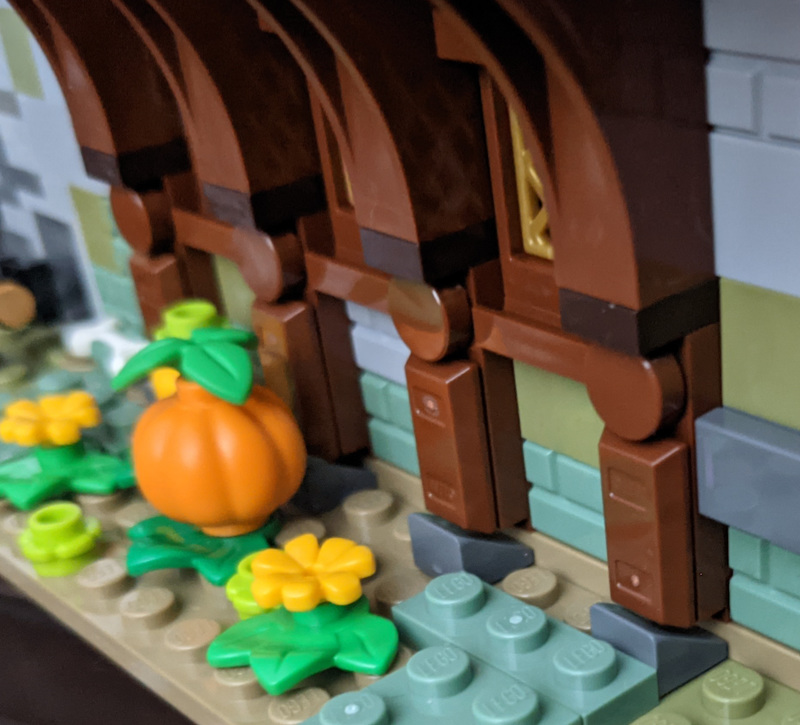
The layout of the first floor is largely the same between the proposal and the official set. A stone stairway on the left side takes you to the living quarters, while the forge sits on the front of the building, though the door into the workshop has been moved to between the stairs and the forge. The under-the-stairs door into the workshop has been replaced by a place to store firewood. Moving the workshop door to the front is an improvement; not only does it liven up the front view, it make more sense to give the blacksmith easy access to his shop from the outdoor forge.
The arches supporting the second story on the right side remain. A 2x6 extension on the back side has been removed in the official set. The larger window remains on the rear side remains while the smaller one has been replaced by a stone arch.
Stonework

Next up, literally, is the first floor walls, made of stone both in the proposal and the official set, as well as Daniel’s. Here we see a pretty faithful application of Clemens’ techniques in the official set. Most of the stone is light bley with dark bley accent bricks. The official set does start to add some color by using olive and sand green bricks. This seems like a natural choice to me and is undoubtedly an improvement to the original design, especially given how tattered the original design’s roof is, having worn stone is natural).
Aside from the color change, the stones are laid more squarely in the official set and utilize fewer tile-on-SNOT. This creates a smoother and simpler design, but takes away some important details in the original proposal. I would have preferred a few more SNOT+tiles used in the middle of the walls as well as some plates to give a more weathered and imperfect look. Even with the simplicity, you can see the difference 17 years can make when you look at the flat-gray-brick used in Daniel’s 2002 set.
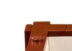
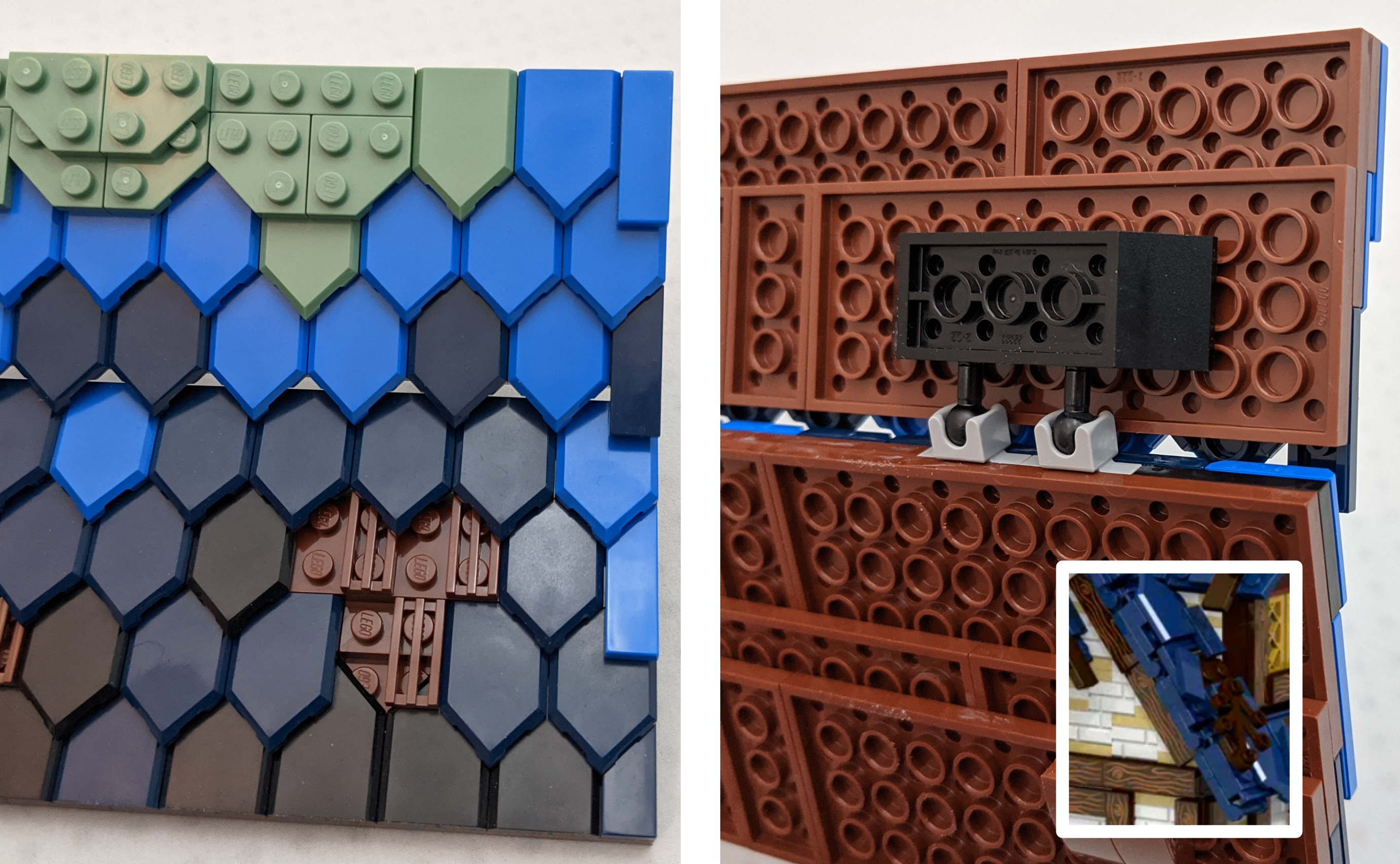
To add back some detail, official set adds decorative stones above the 6-wide arches, not present in the original MOC. It can be seen over two doorways and the forge. This design works well with the corners, which use dark bley tiles on SNOT bricks and take advantage of the fact that 1x2 tiles can ‘slide’ on a single stud, allowing the corner tiles on each side of the wall line up perfectly.*
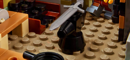
Forge and First Floor Interior
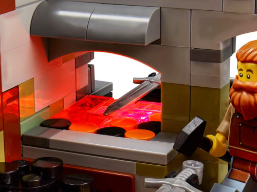
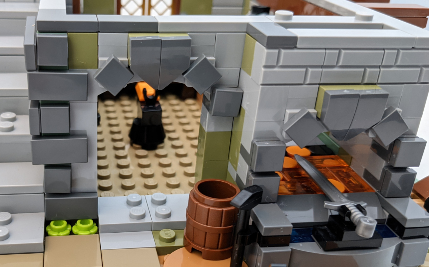
The forge in the official set is accessible from inside and outside the building, which is more apparent in the official set than in the proposal. Coal, iron ingots and bars are available in plenty inside. Tools include two anvils (inside and out), hammers a shovel and a broom as well as a grinding wheel, which is a nice touch. My favorite part is the bellows. Bellows are critically important for a forge and often missing from blacksmith MOCs, including the proposal and the 2002 set. Pressing the bellows turns on a LEGO light brick, which illuminates the hot coals of the forge.
Now comes my first real complaint about the set; the first floor (as well as the others) is bare studs, whereas they were tiled in Clemens’ approved submission. While this makes minifigure positioning easier, this lack of detail is disappointing. A stone and dirt floor for the first level would have been terrific.
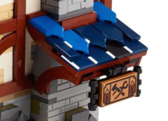
The sign appearing above the forge is a printed 2x4 tile. It is affixed to the overhanging roof on the second story and is high enough it does not hit the ground when you remove the second story and set it down.
Half Timber, Wattle and Daub
The woodwork and wattle-and-daub techniques is where this set really shines. This amount of detail is unparalleled in any other official LEGO set, especially that of Daniel’s 2002 blacksmith and even 10193 Medieval Market Village.
Starting on the back of the first floor, we can see the wooden arches brace the larger second floor. I particularly like how the wood sits on the stone foundation using dark bley cheese slopes and how the brown ingot pieces fit just right.
Other than the chimney, the second floor is devoid of all stone, unlike the accepted proposal, which kept the stone for half of the walls. This change is a slight improvement as the wattle and daub technique is done so well, having it on show no matter what side of the building you are on is fantastic.
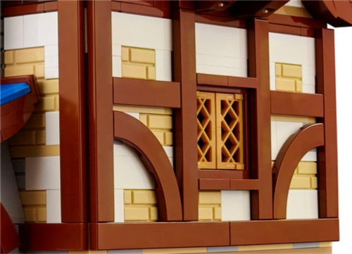
Like real buildings, most of the wood beams are set at 90° from each other. Variety is provided via arch shapes, both support arches themselves (a set on the side over the pumpkin patch and another set over the first floor stairs) as well as the 4x4 macaroni tiles. While the macaroni tiles do add needed wood shape variety missing from the original proposal, I was hoping LEGO would have found are more clever method of angled wooden beams, which are common on many read half-timbered buildings, but rare in LEGO buildings, except for a 1x6 tile ‘on top’ of all the 90° tiles/bricks.
My other pet peeve of using tiles for a half-timbered/wattle and daub is the corners. In a real building, there would be a thick corner post, but this technique gives a plus (+) shaped corner when viewed from above. Here too, I hoped LEGO might find a better technique us MOC builders could use. Lest you think me too critical, I have used this technique myself as it does a decent job.
The timber wall tiles are flush with the top of the second floor, leaving an almost seamless transition to the third floor’s timber. I say almost, because the 16x16 dark tan plates are visible from the outside of the building. Though these are hardly noticeable, and sort of blend in with the yellowing (tan) parts of the wattle and daub parts of the wall, these sorts of details are generally hidden carefully in MOCs, as well as Clemens’ proposal.
While all the wood technique is great (despite my minor gripes above), it is largely in reddish brown, rather than the dark brown of the proposal. Ignoring the brightness of the overall set, I know many people were hoping for dark brown in this set. This certainly would have required existing pieces be printed in dark brown for the first time. The frequent use of wood grain printed tiles in the proposal is also missing from the final product. I’m guessing between dark brown being more brittle than even reddish brown and the cost of printing dark brown pieces for the first time, using reddish brown was an easy decision for LEGO. But I too was hoping for a bounty of dark brown pieces.
Doors
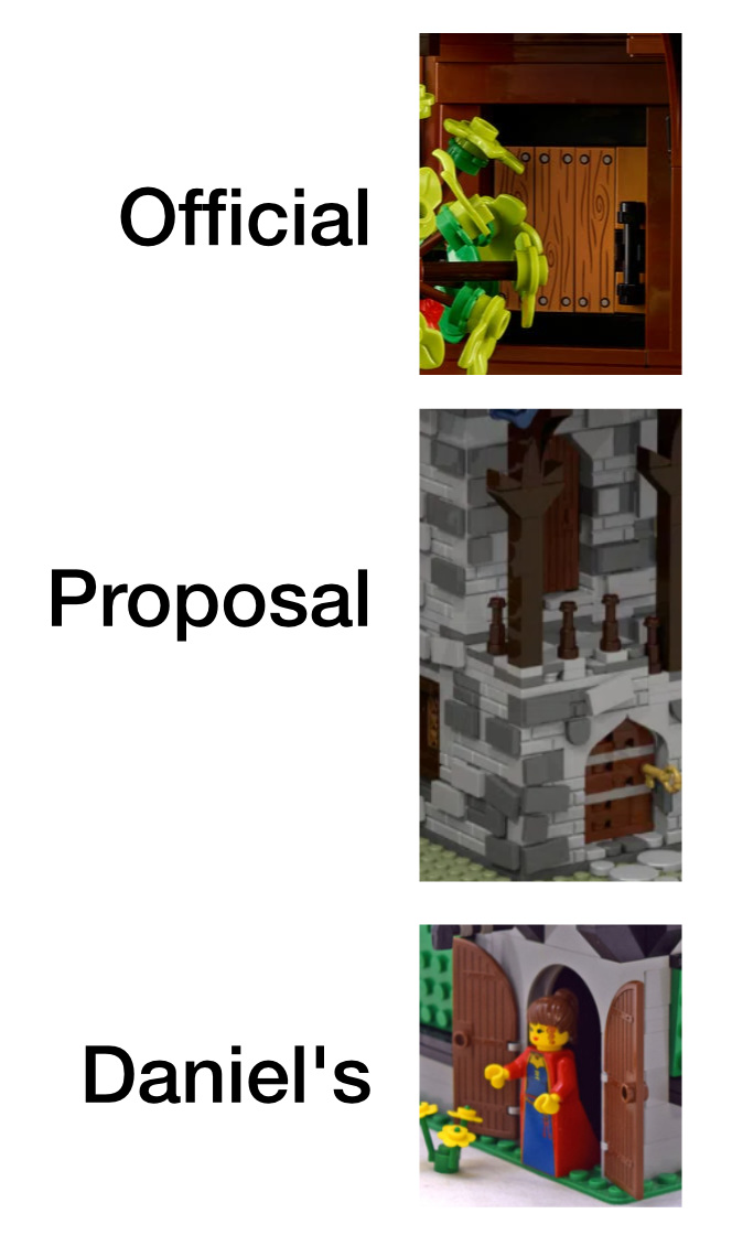
The doors of the final set are both 4-wide, SNOT tiles on plates and are functional. They fully sit behind the wall, so when closed, the protrude on the interior, but look good from the outside. Here, printed wood grain nougat tiles are used to good effect.
In the proposed set, two different doors are used. On the first floor, a run-down brick-built (well, plate built) door can be seen. The second floor door was a bit taller and appears to be a pre-fab door, like the one used in many classic castle buildings, including Daniel’s blacksmith.
Second Floor Interior
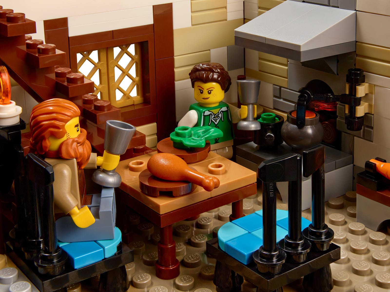
The second floor consists of kitchen/dining area. The oven and stove feature many pots to cook the gourds grown outside as well as what game the archer (the blacksmith’s wife) might bag - a turkey leg appears to have been the most recent quarry.
A table and two chairs occupy the center of the room. While the table is plain enough, the 3x3 chairs are quite unique and feature quilted seat pads. Black axes make up the chair backs. I do like the look of these chairs; I can imagine them being made by the blacksmith, but if so, they would be impossibly heavy. The 3-wide size is quite large, it fits ok.
A barrel of ale sits nicely under the stairs, which do take up about one sixth of the room. Two candles, on simple sconces, adorn the back wall window. A butter churn is tucked away next to the stove.
Like the first floor, this one is bare studs as well. Brown tiles would have made a great wood floor, as in the original proposal.
In Clemens’ proposal, this floor also housed a large bed, night stand and small dresser. The bed has been moved to the third floor in the official set.
Third Floor Exterior

Ignoring the roof and choice of reddish brown, from the outside, the proposed model and final set are structured the same way, including the dormer window (moved due to the chimney placement) and box bay window.
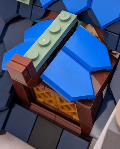
The dormer window technique is fairly simple, using a hinge brick/plate to hold the roof tiles on, but looks terrific. The gaps around the window and its roof are minimal, but discernible. While the roof under the window stands out a bit due to the square shingles, the gaps are nonexistent. The decoration at the peak is simple but effective.
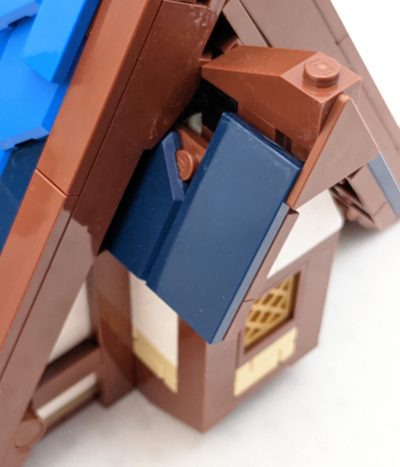
The box bay window under the eves is less impressive. The gaps around the window, particularly on the roof, are large. The decoration at the peak is the best part, the use of the triangle piece is terrific.
Next to the box bay window, two stacked brown 1x2 rail plates make a great substitute for 1x2 tiles.
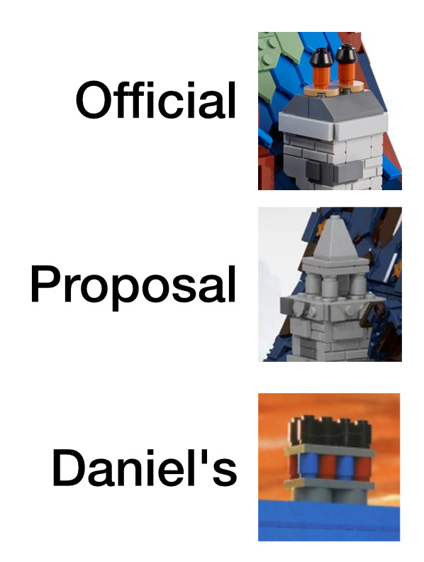
While the chimney size remained similar in the final set, the top decoration was changed significantly. The large, ornate stone steeple has been replaced by ceramic tubes with iron hats. I have no idea which design is historically accurate. While I like both designs, the original is more ornate. The final version does seem to use pieces (the hats) a blacksmith might produce.
Third Floor Interior
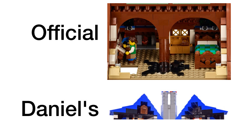
The third floor interior houses the bedroom for the blacksmith and the archer. While the original proposal had a third floor, it did not appear to have an interior. Daniel’s 2002 set had a tiny attic. The final model allows access by removing the back roof piece. Like the other floors, the ground is bare studs, except for a bear skin rug.
Adding a third floor was a great alteration to the original proposal. It came at the cost of adding a stair way to the kitchen/dining area, but it was worth it. While the ceiling is low, there is much more space for the two inhabitance to move around - everything feels spacious and comfortable at the same time.
My biggest gripe is the use of arches to support the peak of the roof. This certainly would have been accomplished in real life with a large wood beam spanning the room. If that was not sufficient, support under a vertical support beam would have been needed in the second and first floors. From a MOC point of view, it does make the room crowded and hard to access the back of the room.
One one side of the room, there is a writing desk with a simple stool, side table and oil lamp. A fireplace is also attached to the chimney.
The desk and table are nice touches. The oil lamp is necessary to cast light in this dark corner, as the window is on the other side of the slanted desk.
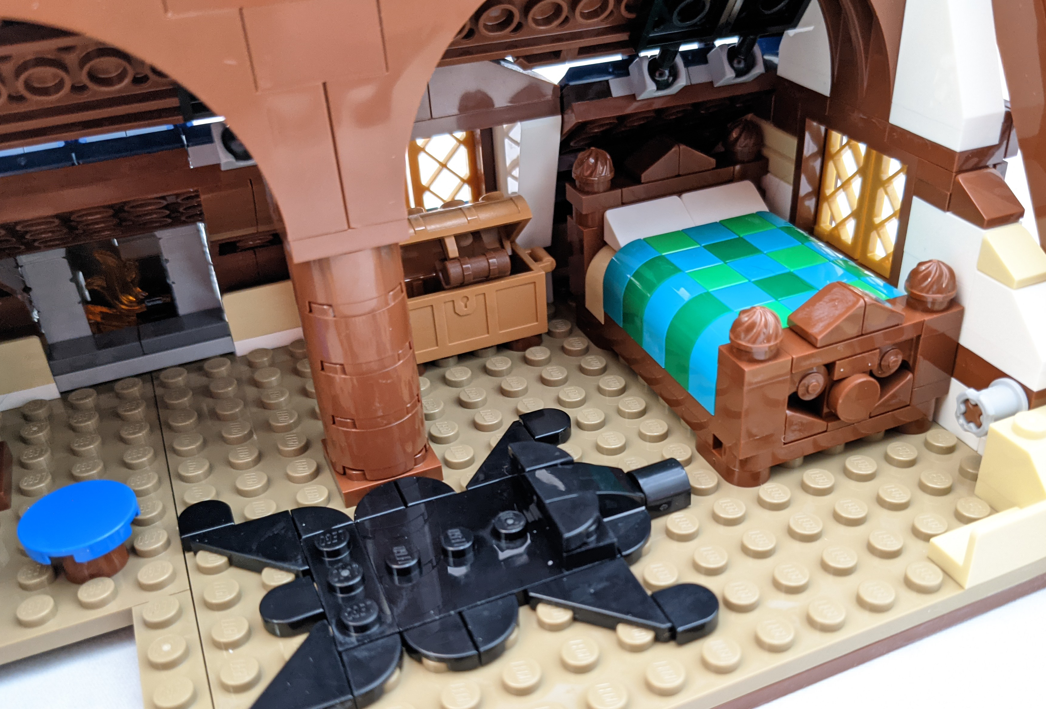
The other side of the bedroom features the bed and bear skin rug as well as a chest with compass and backpack.
The bed is terrific. It gives the look of carefully carved wood and would surely be a piece of furniture passed down generations. The quilt on the bed makes these plastic bricks look more comfortable than any other MOC I’ve seen. All the bed is missing is a night stand or two, and there is room for this if the trunk were moved out from under the dormer window.
Also missing from the proposal is a wardrobe, or dresser substitute. While the (treasure) chest fits the low ceilings well, I do wonder where they keep their clothes.
The bear skin rug is an excellent addition to the set. Not only does it break up the ugly studs-only floor, but adds some back story to the archer’s conquests.
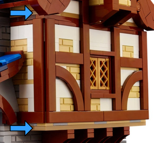
My last complaint about the third floor interior is the visible pins that hold the outer roof rakes. The whole technique looks great from the outside (see more in the next section), but leaves ugly bley bushings protruding from the interior walls.
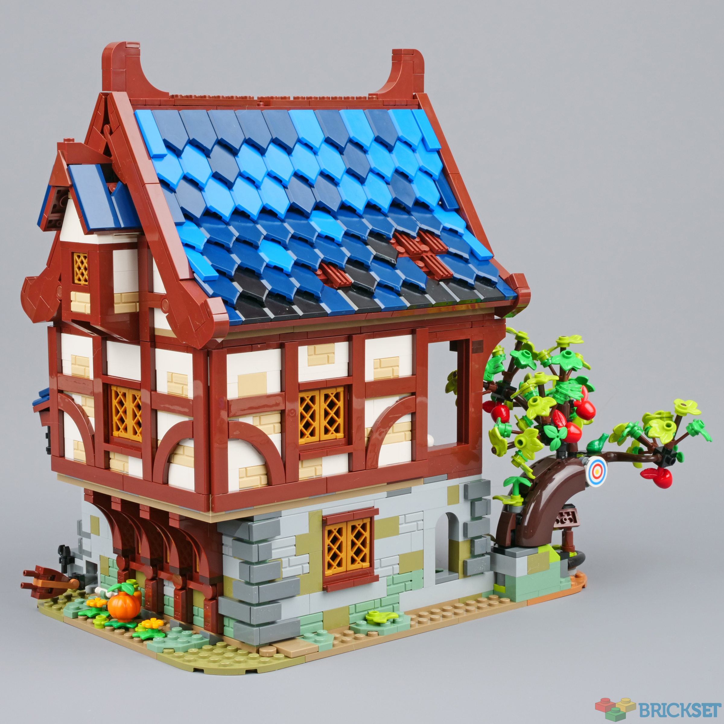
Roof
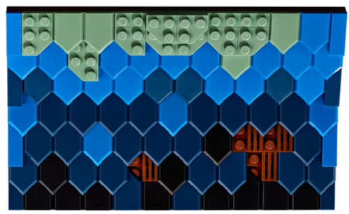
The roof of this medieval house is the most technical, parts intensive roof of any official set made by LEGO, except for 10234 Sydney Opera House. It features a unique slate shingle pattern made of Nexo Knights Shield Tiles. Wooden rakes adorn either side and decorative wooden beams top it.
The roof this the third major change in between the proposal and the final set. While still in the blue family of colors (as was the 2002 blacksmith set), its technique is vastly different than Clemens’ design. His technique, while it did use a few pentagon tiles, relied on stacks of dark blue jumpers and tiles, often placed at odd angles. This leaves the proposal’s roof looking much more worn than the rest of the proposal’s building, which shows no sign of wear. Dark tan tiles as well as limb elements and nougat stars add to the technique (I’m not sure what those stars are supposed to be).
The curve of the proposal’s roof was made using several rows of clips and bars, all mostly hidden by the disheveled tiles. While this curve is somewhat subtle, there is a pronounced angle near the top, above the dormer window (and chimney), which is preserved well in the final set. The angle is achieved using Mixel/ball joints. The seam in the roof is not generally noticeable, especially if the roof is on the building, in which case, the interior is dark blends in with the dark roof tiles. The roof above the box window and over the outdoor forge is also present. So while the technique and texture of the of the roof changed greatly, the overall shape remains true.
The roof in Clemens’ proposal looks like it was affixed to the building and immovable. This prevents access to the attic of the building, which plays a key role in the official set. I’m sure a design challenge for the official set was to make a removeable roof that would not break apart when removed and replaced during play. The final version of the roof is quite sturdy allowing it (at least the back side) to come off and on over and over again. The front roof technically just sits on the building as well, but the dormer window and chimney keep it in place.
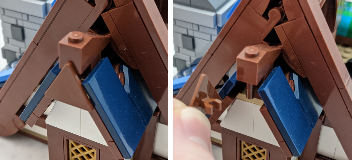
New to the official set are wooden rakes that adorn either side. These are missing from the proposal, which has a rougher edge protruding slightly more toward the peak. The rakes’ decoration matches that of the top/peak. They are ornate without being overly done, though not quite as fancy or heavy as in the original design. The use of the 30259 triangle piece to cover where the two sides join is just a terrific technique.

The top of the roof is supported by a line of round bricks. This allows the thick roof pieces on the sides to tuck under a bit for a cleaner seam. Some brown (wood) is visible, but this seems reasonable since the roof peak is a long wooden beam. I used a similar technique on my Medieval Cottage MOC.
One small nitpick about the roofs is you can see the brown underside (plate) on the underside of the main roof pieces and over the dormer and box bay window. While not critically important, having these be dark blue would have made them less noticeable and would have added just a bit more refinement to the set.
To get a better understanding of the color differences, I increased the saturation and brightness of the official proposal picture to match the official art. Even with this adjustment, we can see the official roof is much brighter. This is due, of course, to using many regular blue and sand green tiles absent from the proposal.
Many people have argued about the accuracy of the moss (or other similar growth) as well as the wear pattern that should have the lighter color on the lower parts of the roof, though roofs in this video from Arlington Row in England looks similar to this set. I cannot speak to those, but the gradient from sand green to blue to dark blue to black is pleasing to me. It brightens the building quite a bit livens the who scene in a way that says LEGO doesn’t take itself too seriously. I certainly understand the opinion of those who did not like this direction and wanted the original, darker, less saturated roof.
Around the Building
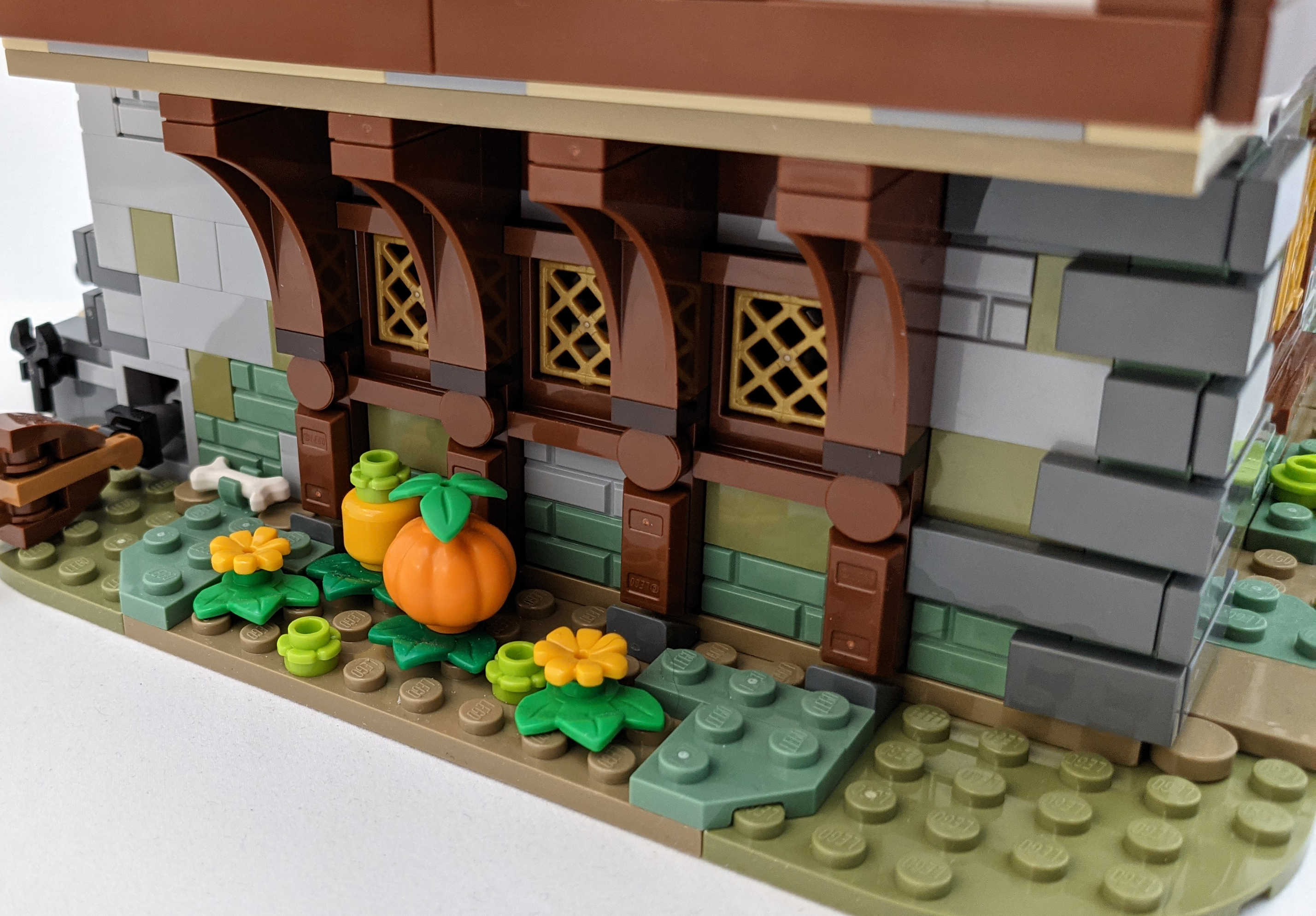
The gourd patch on the right side of the model is one of the few hints to what setting this shop belongs. It features a single pumpkin, one squash-like gourd and flowers and leaves that give the hint of vines. It is simple, but a nice touch. The bone, presumably, belongs to the dog.
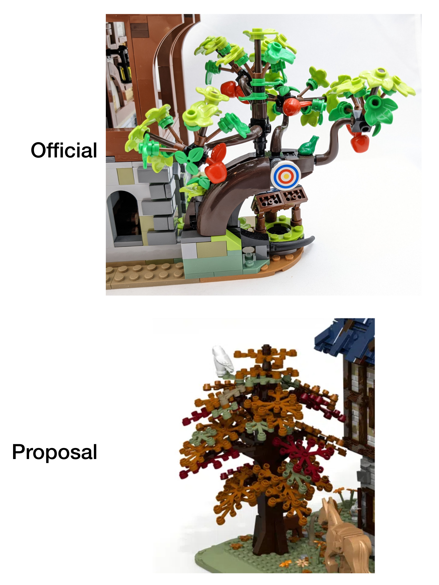
Both the proposal and the final set include a tree, but that is where the similarities end. Originally, the tree was a more traditional brick-built tree with limb elements. In this case, using fall colors. The final set features a gnarled apple tree using a variety of piece types, techniques and connections featuring the new bright 32607 leaf pieces and, of course, apples.
The tree exchange was a bit of a wash for me. I personally preferred the autumn colors in Fiedler’s proposal, but the trunk was proportionally too thick for the size of the tree and number of leaves. It looked too clunky.
The techniques used in the official set are quite fun to put together. The trunk makes use of SNOT connections at different angles to make it (the trunk) very sturdy. I do like the dark brown, but the black, especially the root that sticks out, is too dark for me.
The leaves and upper branches are constructed less sturdily, but still well enough for kids to play with. I feel the leaves are a bit sparse - I would have liked about twice as many, but the tree is already parts intensive (it was the only part of the build that seemed tedious - requiring you to make 4 branches).
My biggest complaint about the set (as I can see no good reason for it, unlike some of the other compromises) is the back base of the tree. It seems to be some sort of wall or stone. It does connect to the building, but visually it is hard to tell and I think that is for structural integrity of the build rather than representing a garden wall. My complaint is how flat and ugly it looks to no purpose. Thankfully it is on the back.
Other than a few leaves and green flowers, that is the extent of the vegetation on the official MOC, whereas the proposal had actual flowers, some grass and bushes. But it makes sense to cut those given the reduction in scope discussed above.
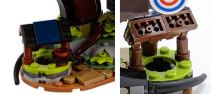
Lastly, we get to the well, which was not present on the proposal. It is simple, but effective - another nice addition. From the front, the roof looks nice, but the back is left unfinished.
Minifigures, Animals and Accessories
A minifigure-focused review this is not. As stated in the overview, the set comes with four minifigures:
- a red-bearded blacksmith
- female archer
- female knight (younger)
- male knight (older)
The archer and blacksmith heads feature two facial patterns while the knights have only one.
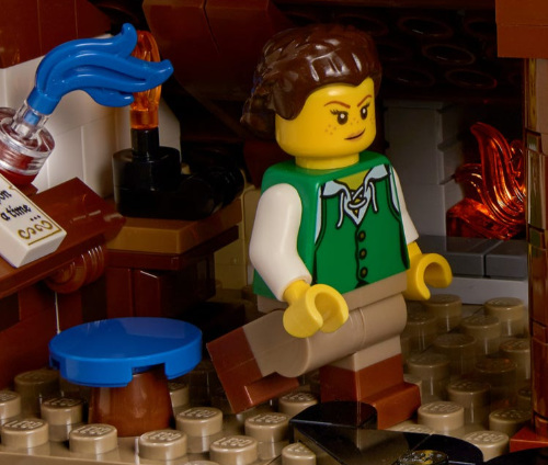
The blacksmith’s clothes are terrific, a great addition to your medieval citizenry. My only gripe is that half my medieval citizens torsos are blacksmiths! But what else would you expect for this set. To add to the duplication, his beard is red - like the many beard pieces featured in King Halbert of the Nexo Knights line.
The archer’s clothes feature a delightful green tunic, also present on in the Pirates of Barracuda Bay 21322, and bi-color (booted?) legs.
The Black Falcons torsos received a modern makeover with additional detail that extends to the printed leg pieces. I’m not a huge fan of the shoulder pieces, they are removed at the moment on my shelf, but it gives something else for the blacksmith to have made and are easily removed. I like the older male face and hair, they will give a nice variety to a castle scene. I do not like how modern the female knight’s hair piece or face with bandana is; medieval female minifigures are few and far between, and having one more would have been nice.
While the soldiers were not present in the proposed design, they are a great addition to this set. Having customers for the blacksmith makes perfect sense, and having castle heraldry these takes is a boon for castle MOCers. All four included minifigures fit well into the scene.
Having said that, for $150, I would have liked at least one more minifigure, if not two. A child would have been a fairly easy addition; presumably a small bed would need to have been included, but there was room in the attic, especially for a small one near the the top of the stairs. Having an non-soldier customer would have been great too, since many items made by blacksmiths were for civilian use.
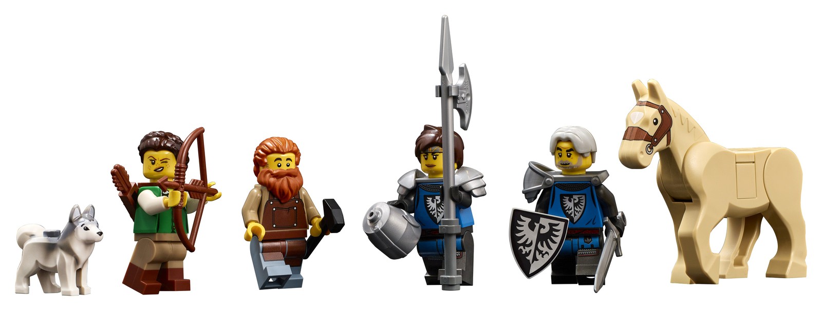
As far as animals go, the horse is the only one worth discussing. This is a new color (tan) and print for the neo-classic horse. It is delightful to have equestrian variety. There isn’t much more to say about it, what you see is what you get.
The only other animals are a husky dog and a green frog. While the dog it nice, I really would have preferred at least one more animal; I think a blue-bird would have fit best without costing too much. I understand them leaving out field animals (the rabbit) and livestock, though a chicken would have been ok. Between the husky dog and the slope of the roof, it is safe to say this is a northern blacksmith.
Everyone was hoping the goat would return. For that to happen, a new mold would have to be recreated, as it was not available for the Jurassic Park set according to Mark Stafford. Again, it is understandable, but everyone, myself included, was hoping for it. I’m crossing my fingers for a farm-based companions set with a goat (and other animal), but not holding my breath, especially after reading this interview
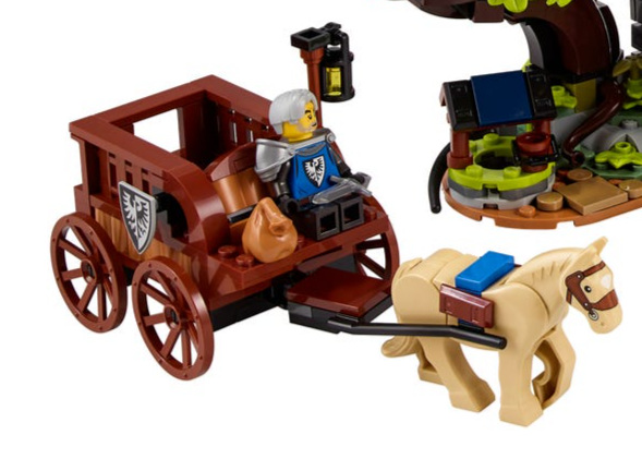
The last addition to the set, not present in the proposal, is a horse drawn cart for the soldiers. This is a terrific idea - having wheel parts and harness for the horse is great, but the design of the cart itself is lackluster. This also gives some depth, and playability, to the set without having to enlarge the building.
Parts
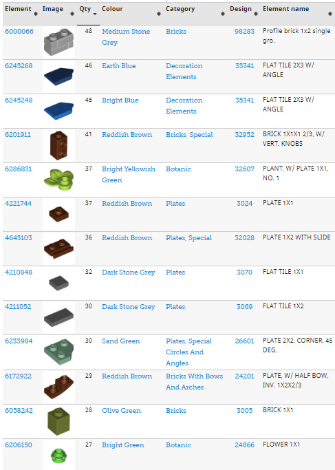
If nothing else, $150 will get you a glut of useful parts for your castle MOCing. There are 2,164 pieces, plus extras. Here are some of the highlights:
- 3 black falcon shields
- 4 metallic swords
- 48 bley and 23 tan profile bricks
- 46 and 45 dark and regular blue pentagonal shield tiles
- 53 plant leaves in lime, bright and regular green
- 92 dark and light bley tiles
- 117 tiles in browns, nougats and dark tans - great for wood/timber
- Many SNOT bricks
- 3 16x16 dark tan plates
- a few dozen medium sized plates in browns and grays
New Elementary has a great view of some of the more novel pieces included in the set. Check them out if you are interested in a discussion of parts.
Miscellaneous
There are no stickers in this set and only a few printed pieces (mostly the minifigures).
While the box art is on a black background, thankfully the instructions are on a lighter color. Previously adult-themed instructions used a black background, which made it hard to differentiate dark colored pieces and positions, especially since all pieces (other than black ones) are outlined in black.
The three stories each come apart nicely, but also fit snuggly together. If you have put the modular sets together, you will be familiar with this technique. I was pleased at how well each story visually fit with the others when placed together.
2-set Update
I’m planning to buy a second copy of this set for the fabulous parts, but I’m considering using some of those parts to fix some of my gripes. If I do that, I’ll make another post and link it here; until then, these are my ideas:
- Tile the first floor interior with stone (gray tiles)
- Tile the second and third floor with brown (wooden floorboards)
- Create a single, long beam across the top of the third floor (removing the center arch & pillar)
- Retile the roof removing the sand green (use brown tiles at the peak - if there are enough)
- Add a nightstand to the bed room, between the bed and the wall (move the bear over 1 stud)
- Possibly add a dresser if there is room
Conclusion
The highest praise I can give this set is to say it looks like a MOC and AFOL would build. It was a day one purchase for me and I recommend anyone who likes LEGO castle to pick up a copy.
LEGO, LEGOLAND, DACTA, DUPLO, PRIMO, FABULAND, SCALA, TECHNIC, MINDSTORMS, and ZNAP, etc. are trademarks or registered trademarks of The LEGO Group, which does not sponsor, authorize, or endorse this site.